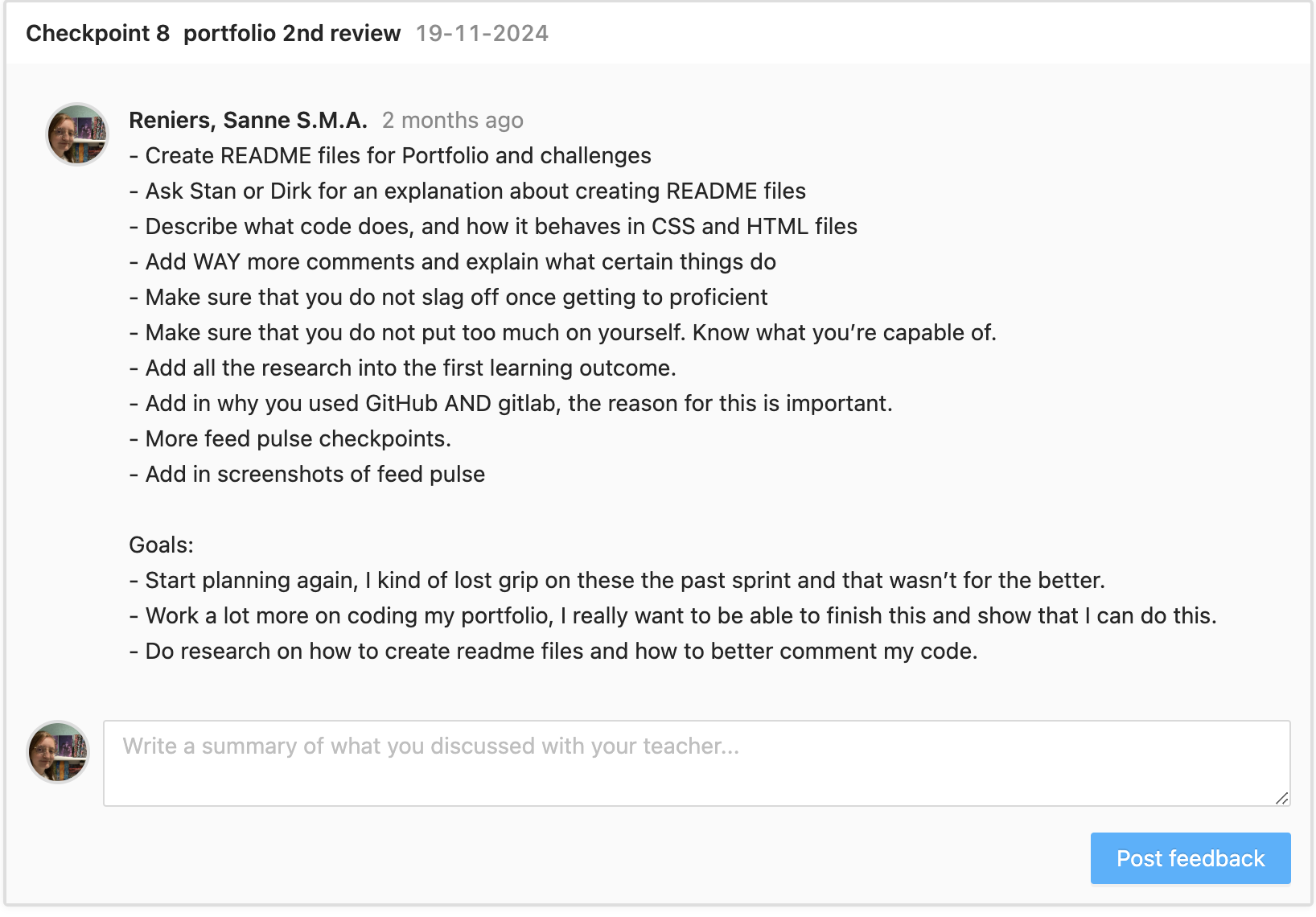
I started the project by creating a project plan. I learned a lot about what steps to follow when starting a project last semester, and I want to continue doing this this semester. This really helps me figure out what I want to do, and how I can continue to do this moving forward. (
 )
)
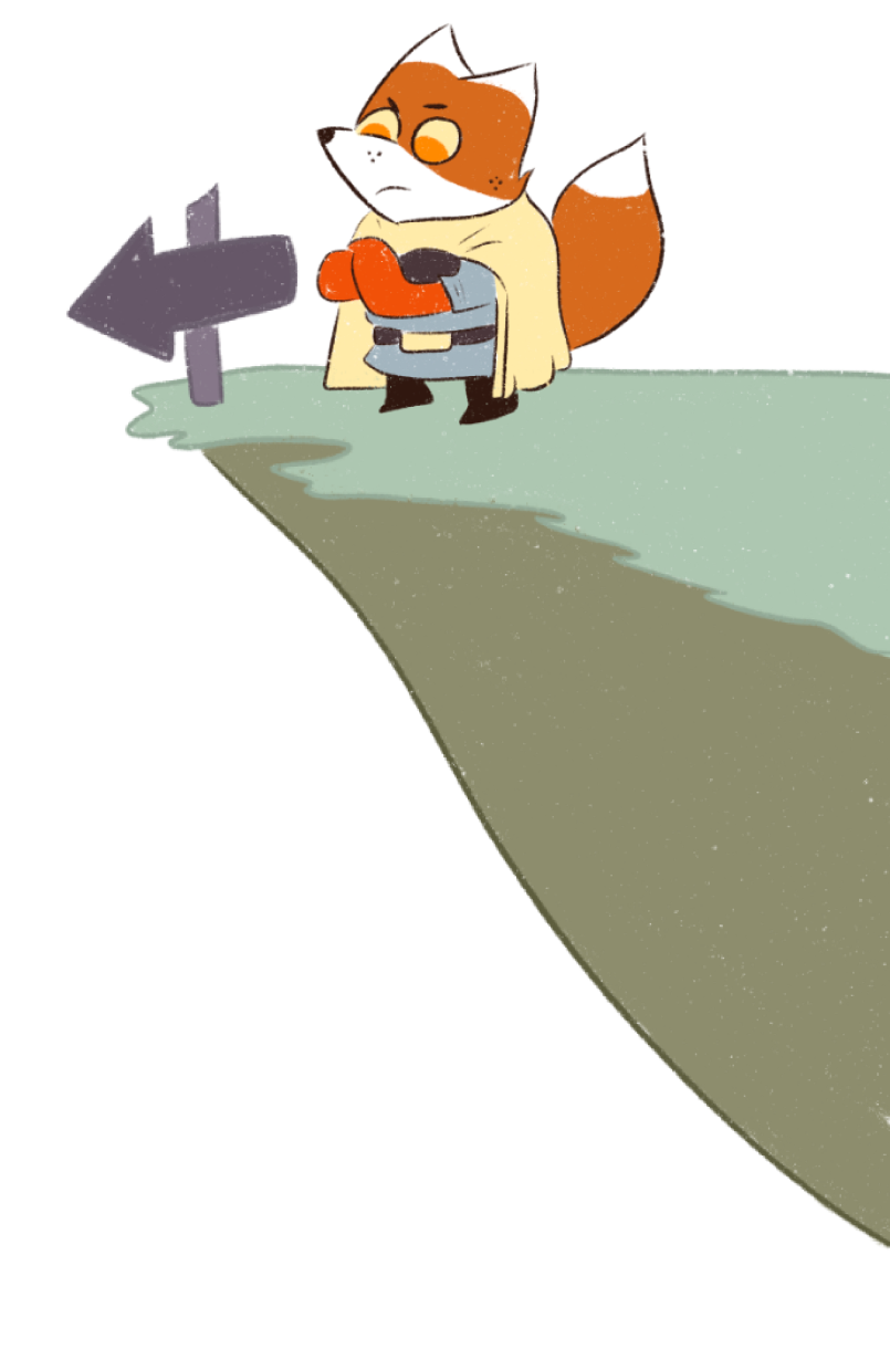
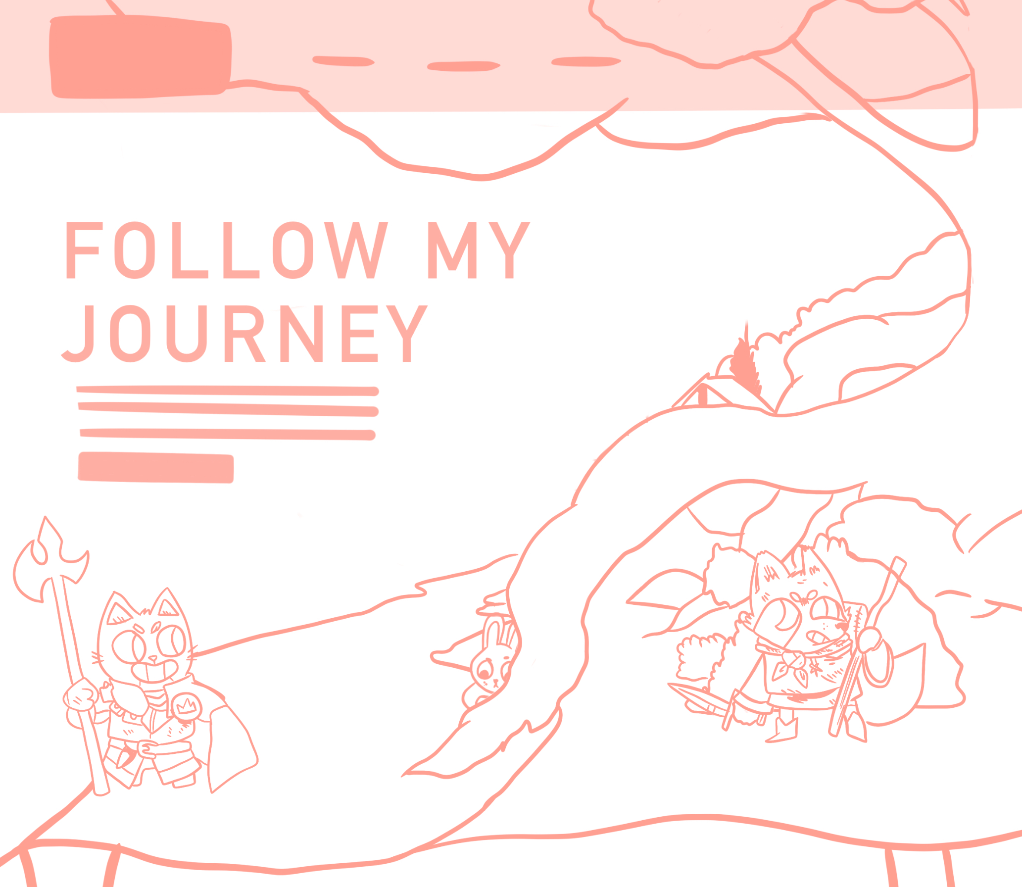
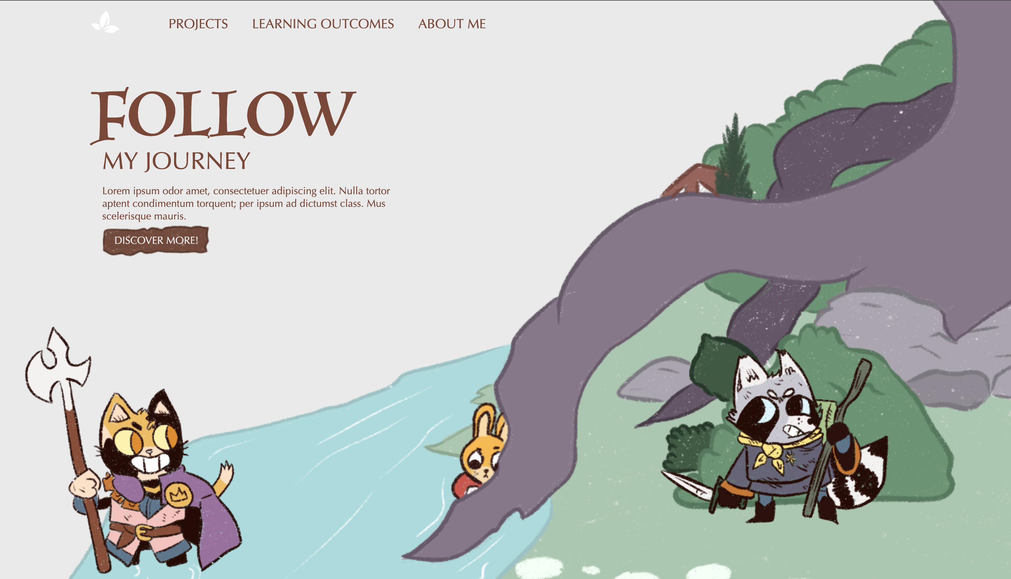
The next main thing that I did, was to look up some inspirational pictures. This helps me set some foundations for my design, and gives me somewhat of a rough idea of what I would like to do. I've been really into a board game called “ROOT” lately, and I thought that this would create an opportunity for me to do and learn more about a style of web design that I find really cool, but that I haven't really used before. The first few pictures that I found where mostly regarding the way I want to tell a story with the website and by using big, full page art to do this. You can see this really well in the first image that I added into Figma. ( )
I think that these kind of websites are really cool, and I would love to get better at these and be able to do them myself. I think that this is quite challenging regarding responsiveness. But I find it a very interesting concept.
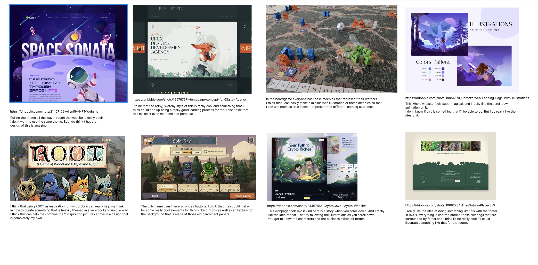
Portfolio inspiration
The colours and font's for this where quite easy, as these are just the colours and fonts that are also used in the board game itself. At first I was planning to only use those, but I got the feedback to only use the big ROOT font ( luminaries ) for accent words or just 1 single letter as this really pulls in your attention, and this might not always be what you want to achieve.
I feel like this is really good feedback, and not something that I thought of on the spot. Due to this, I choose to use that font, along with a sans serif font that is clear, while still being a little bit stylised. ( optima ). ( )
)

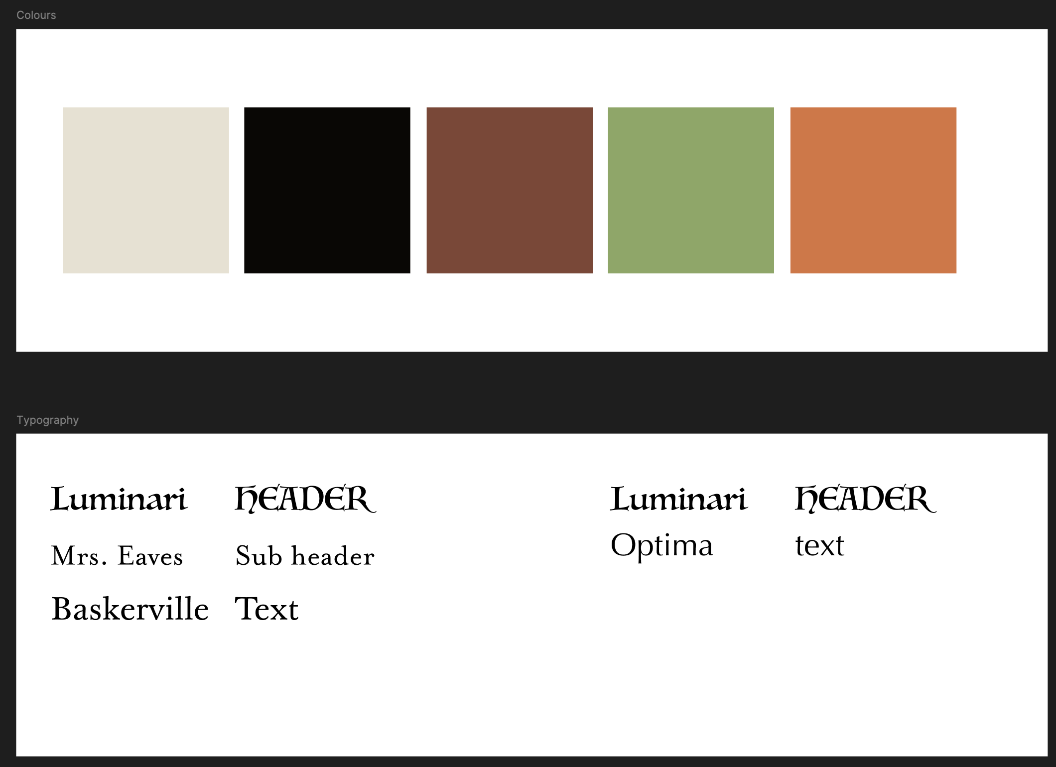
Portfolio colour and font inspiration
My concept
The concept for my portfolio at the moment is to create a design that is very big on illustrations. I want to create a portfolio in the style and including the character from ROOT, but in my own style. I want it to tell a story as you scroll down, where at the bottom the story is complete. ( )
)
Wireframes
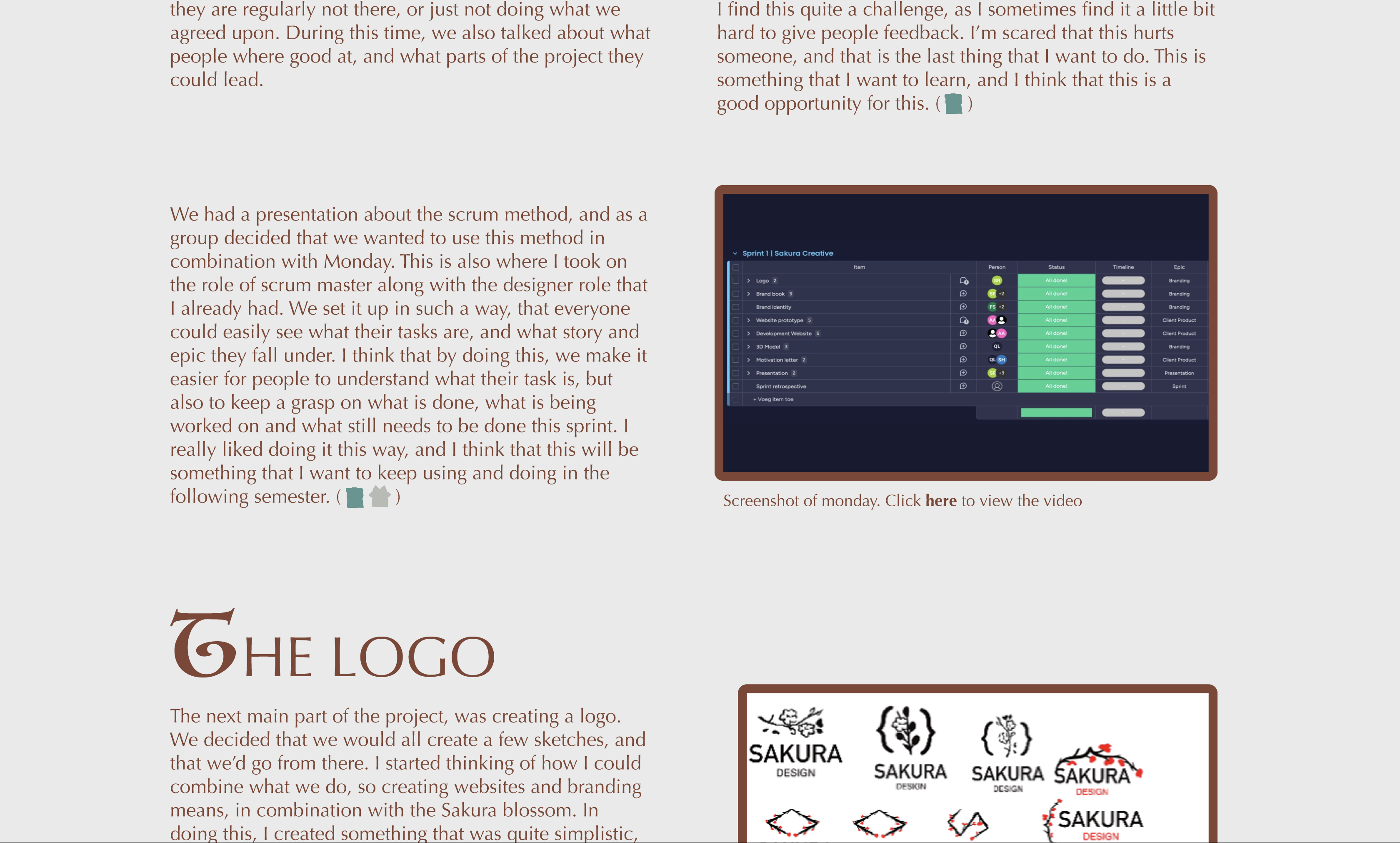
I then went on to create a wireframe, so that I had a rough outline of what I wanted to have in the website, and what the layout of this would be. I got feedback on this wireframe, and was told to work a little bit more on this. Mostly in terms of how big the columns are.
- Try to use the font's that figma offers. There are a few that give you a block. This way you can already see what size you need to make certain fields. ()
Instead of doing this in FIGMA, I decided to start drawing out the illustrations inside the layout, and to in there make sure that I set up the correct blocks for where the text would go. I thought that this would be easier, as in the end I would be working around the illustrations. This makes it very important to know up front if it works or doesn't work. ()

Portfolio wireframe 1st version
I heard from Dirk that for the first portfolio review, it was important to have not just the wireframe, but to also have somewhat of a first design already laid out.
I started this off by starting to sketch something out in procreate. I knew that what I wanted to do would mean that I had to draw a lot, so for me this was the easiest way to do this. I didn't want to use the art directly from the board game, but I did end up using it as reference and inspirational material. In the speed paint that procreate generates you can see that I used one of the artworks that is posted online to create an outline of what I wanted to use for my portfolio. I am normally not the biggest fan of tracing over the art of others, but I knew that if I wanted to pull this off, this was the quickest way to get to a design that I was happy with.
When I started colouring my own style starts to show through in terms of the brush that I use, and the way that I try to keep it as minimalistic as possible. I am not really adding in any of the details. I reference to the original artwork for the colours, but that is about it.
I asked Dirk for feedback when I was done with the characters. The main feedback I got was that it looked good, but that he wasn't exactly sure about using no outline for the background. Where I can get what he means with this, as the style between the characters and the background is pretty big that way. I also didn't know if I'd look good when using the same outline as the characters for the background. I don't want someone attention to go to the background, so it was important to me that this was not as detailed as the characters. ()
1st sketch of portfolio
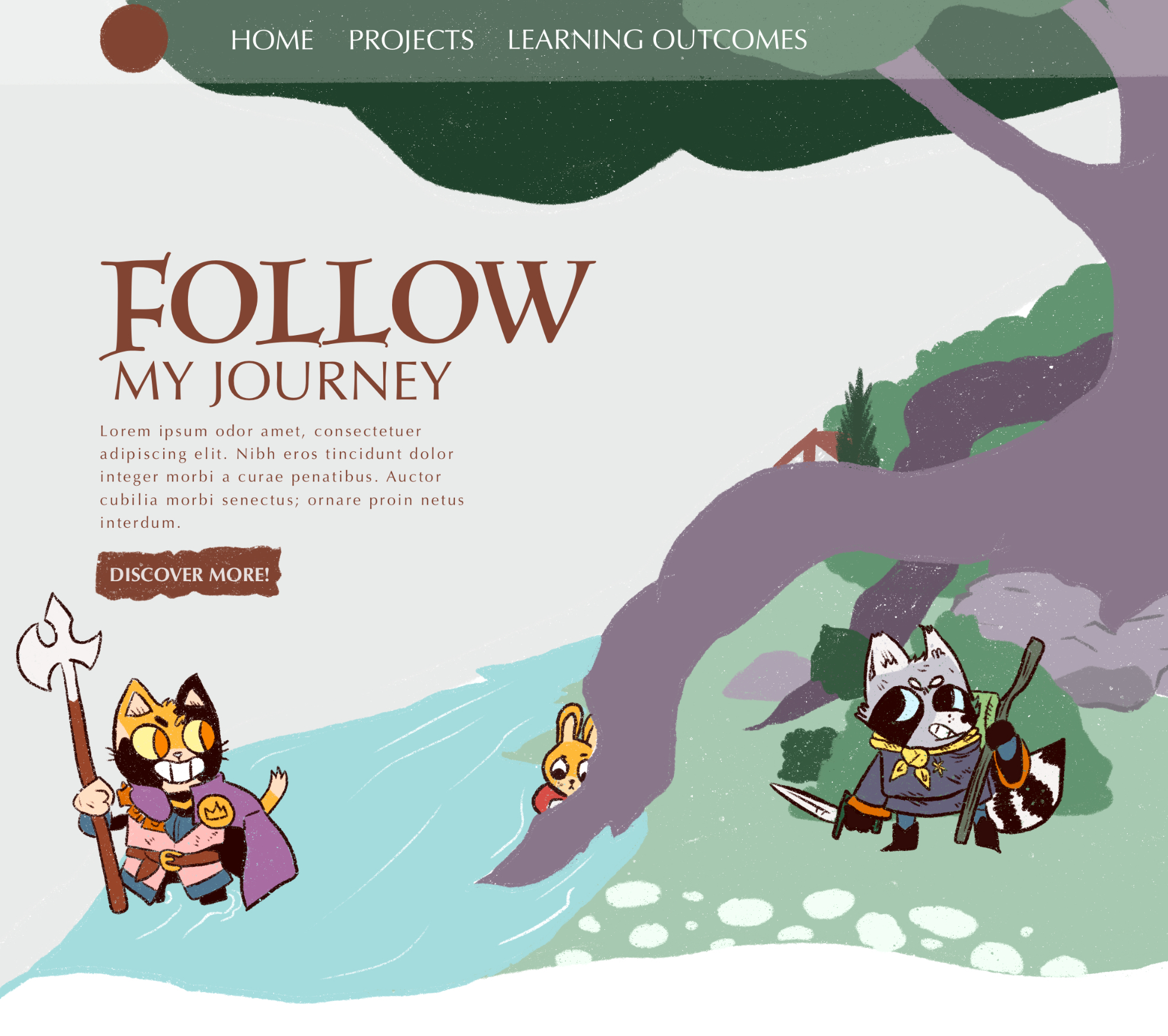
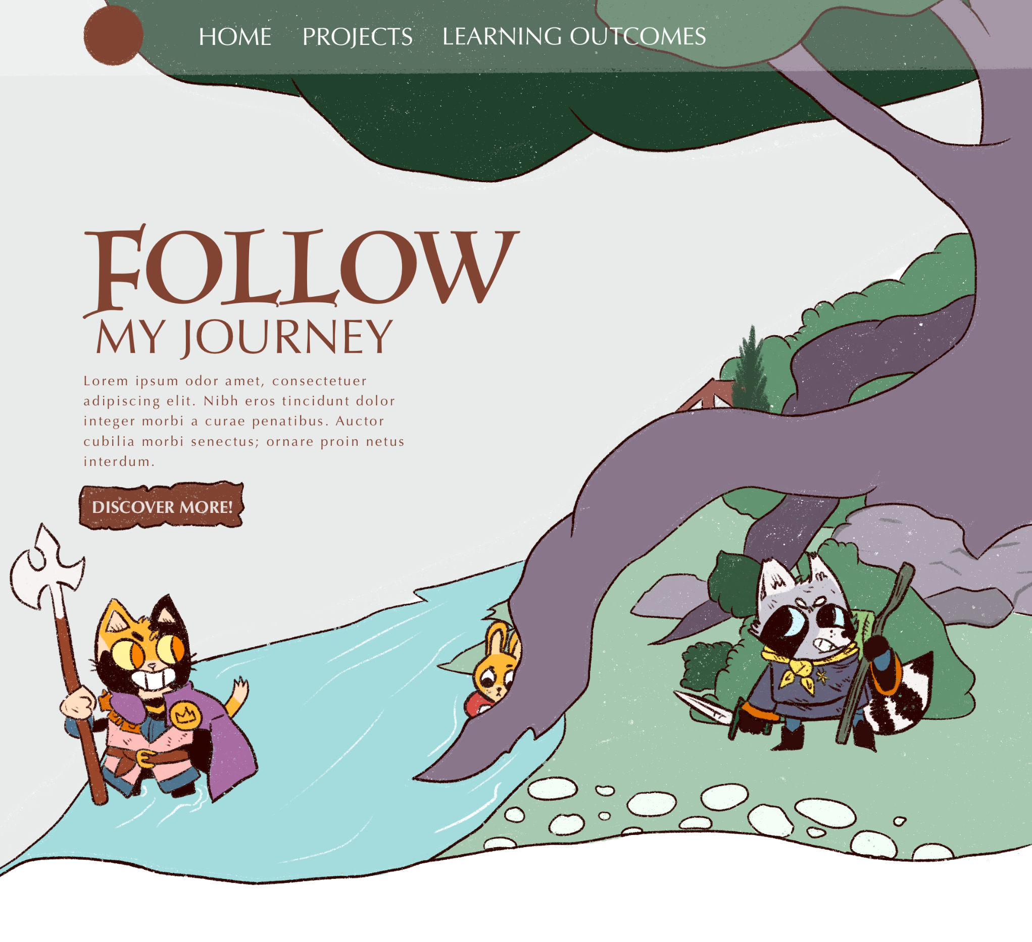
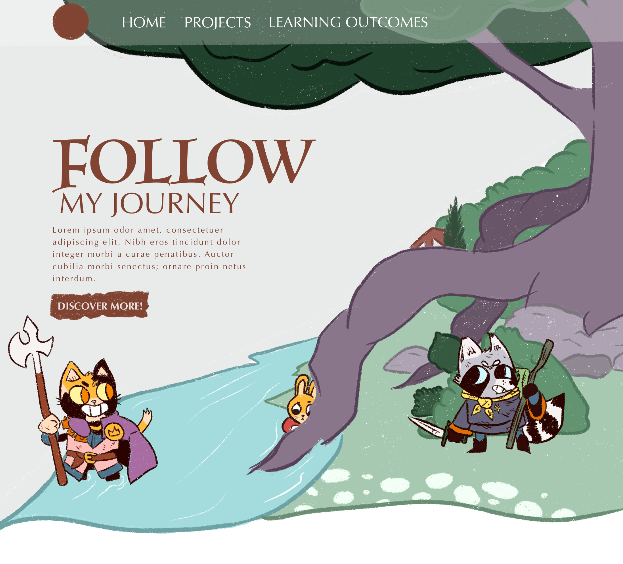
I created a few iterations based on this, with different outlines for the background. 1 without, 1 with the original outline, 1 with thick coloured lines and 1 with thinner coloured lines. I didn't ask just the teachers for their opinion, but also asked some people around me. Most people liked the one with the thinner coloured lines the most. It blended in a bit more, while style wise keeping it relatively close to the style of the characters. I agree with this, and I think that this one is also my favourite. This is therefore also the style that I want to move forward with. ( )
Coloured design with no outline in the background.
Coloured design with a black outline in the background.
Coloured design with a heavy coloured outline in the background.
Coloured design with a thin coloured outline in the background - final design.
Interactive prototypes
From the iterations that I did last time, I was able to start creating an interactive prototype. This helps me establish certain elements that I want to include in my final website, but also makes it so that I can easily test this with teachers and users. It also gave me a way to test out how my illustrations would go with the rest of the content, which was something that for this design was really important.
I am very happy with the way it is looking right now, the combination of actual content and illustrations on the follow up pages look good, I do want to ask for some feedback on this. As it feels like I am still missing something when I scroll further down. For the follow up pages, I only have the illustration at the top, and after that the only thing you see is the content of the page. It feels a bit blank and I want to see if anyone might have an idea to solve this. ()
Final design
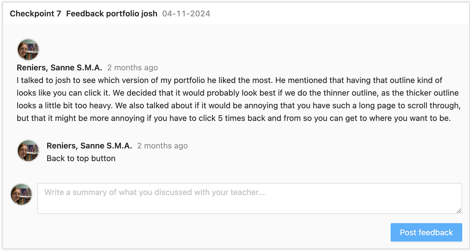
When creating the content page for my portfolio, I struggled a bit with home I wanted the images the look. I wasn't sure if I wanted an outline, if I didn't want an outline, or if I wanted a thinner outline. I talked to Josh about this, and with his feedback decided on the following:
- When an image has an outline, you make the user think that they can click on that object. I want the images to be opened in a lightbox when you click on them, so an outline would help convey this message to the user.
- The heavy outline makes the image stand out a little bit too much, so I decided on using the thinner outline so to make it clear to the user that they can click on that image.
Along with that, we had a talk about the structure. A few of the takeaways of this feedback are:
- Don't overthink the structure, as long as we can read your process it's fine.
- If you keep it the way it is right now, then I would strongly advise having a back to top button, along with a button to open a pop-up for the learning outcomes. This can really help with knowing what each icon stands for, and helps us not to be scrolling back and from as much.
Based on this feedback I decided that for the final version, this would be something that I would look into. I think that adding these will add a lot to my portfolio, but will also include a new learning experience for me, which is always a plus. ( iterative design, personal leadership )
Images on portfolio with heavy outline
Images on portfolio with thin outline
Development
The first thing that I struggled with during the development of the website, was that it changed between full screen and not full screen which made all of the meeples move where they where placed on top of the background. I found this really frustrating, as I want the teacher to be able to view it the correct way once they check my portfolio. This was mostly very obvious when looking at the little rabbit in the middle of the scene. I didn't want to create 1 still image for this, as in the ideal way I would like to create little animation for these characters if I have the time to do so.
I talked to Dirk, Michael and Petra about this, and we came to a few conclusions:
- Putting the background and the meeples inside a div and then putting the meeples in another div so that we can outline the meeples to always be at the bottom worked slightly, but not completely in the way that I wanted it. They still moved up slightly, although in a less bad way then it did at first.
- We tried putting everything in 1 DIV, and then making sure to align things with percentages instead of with view height and view width. Where this solved it a little bit better and for the cat and the racoon this was alright, it still moved the rabbit in such a way that it looked completely off and not like I wanted.
In the end, what we settled on where 2 options.
- I could make the background a fixed size, so that it didn't change sizes when the screen size changes.
- Or I could make everything 1 image, and then create a frame by frame animation for when I want to create that for the meeples.
I decided eventually to do neither of these options. I knew that there would only be a small chance that I would animate anything on the rabbit. Due to this, I decided that I would keep the 2 bigger meeples their own image, but to include the rabbit with the background. Design wise this wouldn't change anything, but it would make this somewhat easier on myself. ( )
)
Old version of the landing page
Final version of the landing page
Transferable production
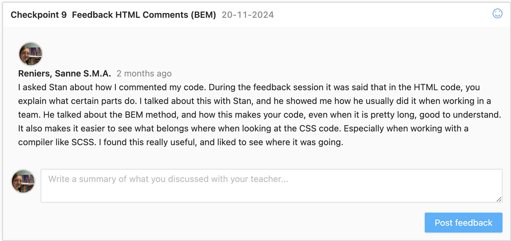
Commenting code
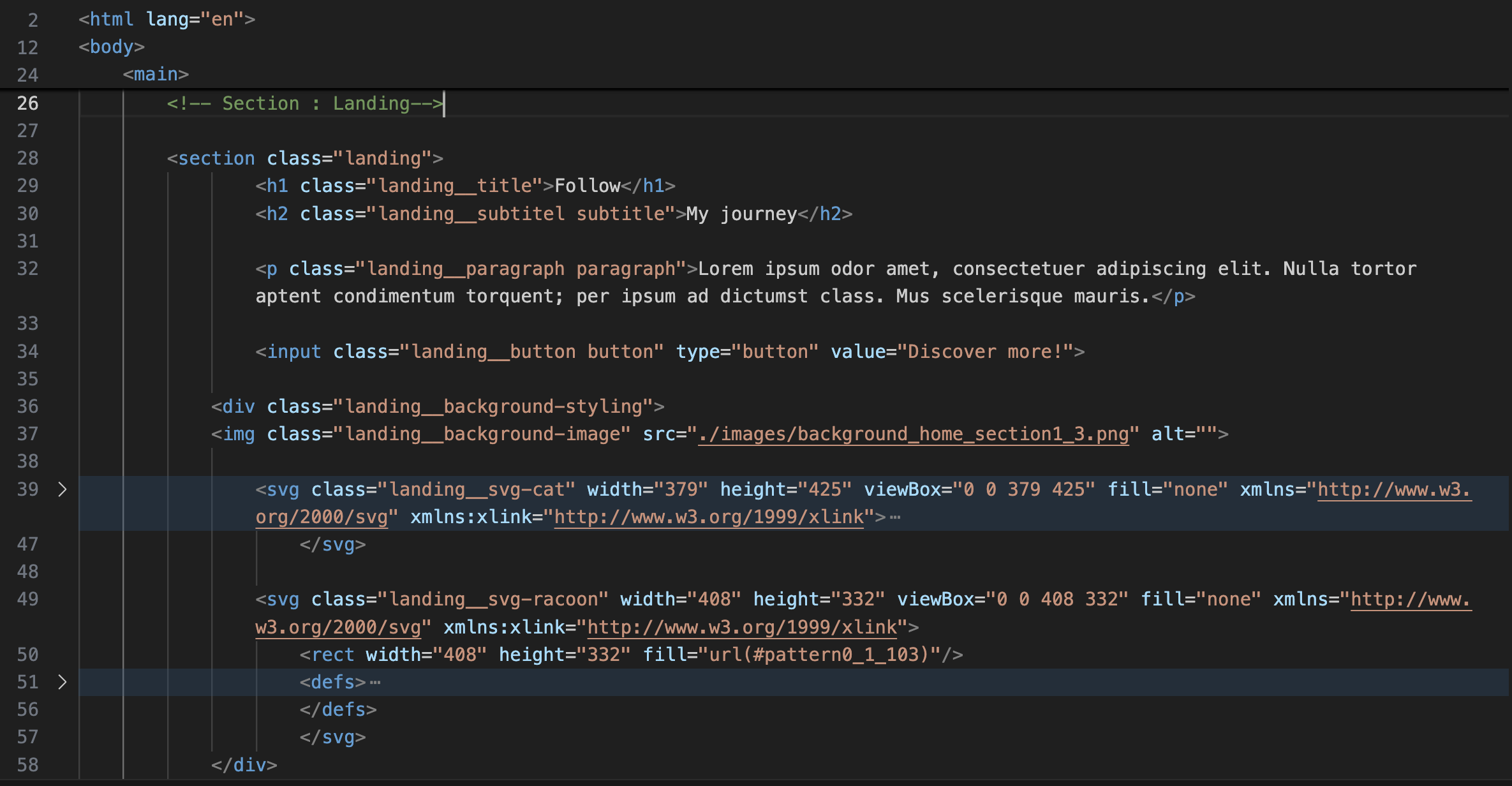
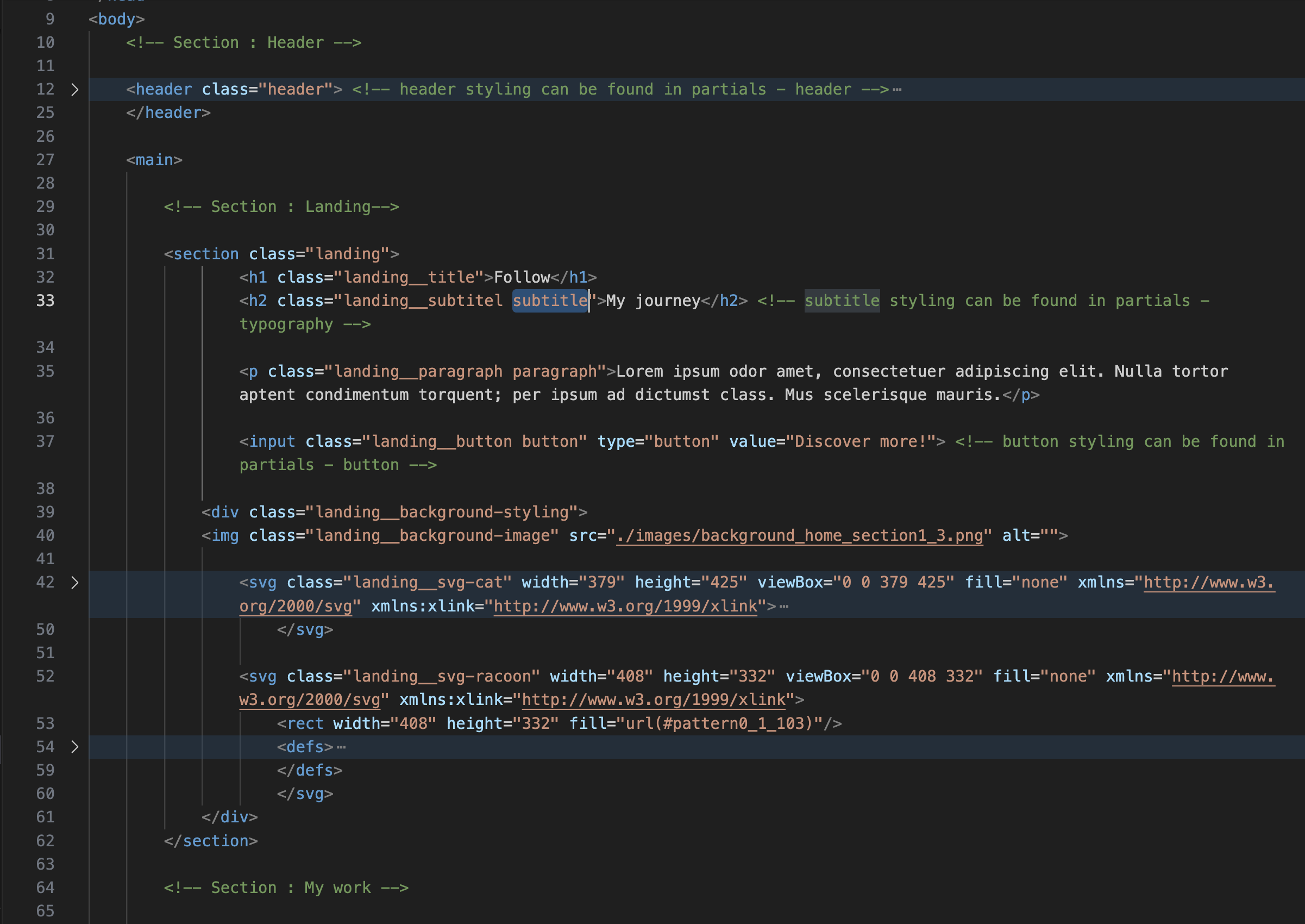
I looked at my code with Stan and went over how to comment my HTML and CSS code with him. He mentioned that explaining what each element did, wasn't important when looking at HTML and CSS code. This is more important when using JS. What he always used, is a method called BEM. In here, you use a comment as some sort of divider to show which section is being altered in both HTML and CSS code. Then, each element gets it's own class which starts with the name of the section, followed by 2 underscored like this: section__. After these underscores, something gets added to show what it is. For example, if I have a H1 title in my section, then the class of this title would be: section__title title. The second title gets added in order to add CSS code for each single title that exists in the website. The font family would be mentioned under title, but the margin would not as this can be different for every title. ( )
I think that by using this method, I can make my code a lot more transferable to people that know how to code. I found it really hard to know what was expected of me in terms of commenting my code, and this explanation and the method helped me a lot with knowing and understanding a bit more about how to go about this, and how to proof that I have learned more about this learning outcome. ()
Readme files
During the last portfolio review, it was mentioned that we did not have a readme file. I was aware of this, but wasn't sure how to do this. After this review and some explanations during a lecture, I tried to create one. I looked at a few different websites, some of these are:
By taking some parts of all of these, I was able to create a readme file for my portfolio project that helps users understand what it was originally made for, what they need to install in order to work with it and how to do this. ()
The readme file can be viewed here
Old version of code
New version of code
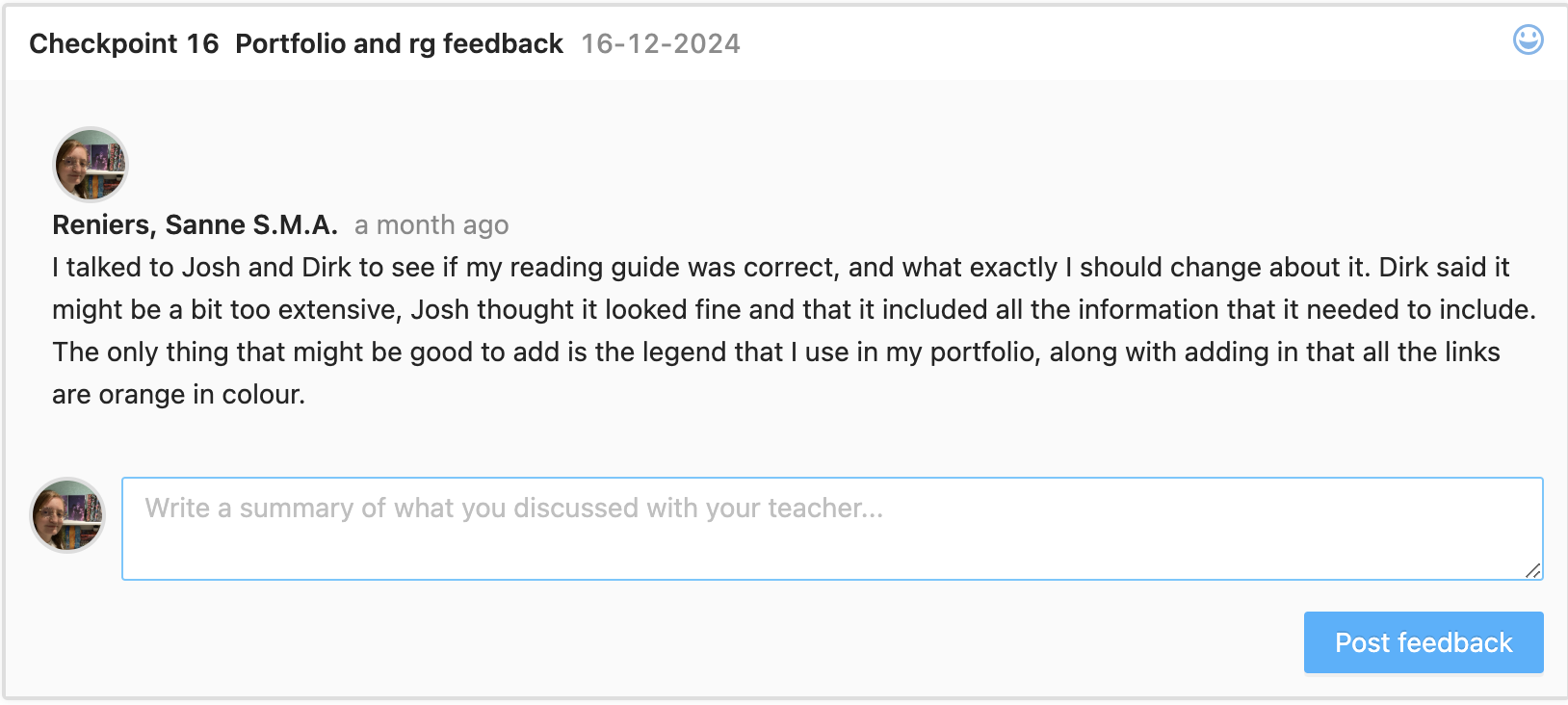
Reading guide
For this semesters, it was a must have to create a reading guide for the teachers which helps them navigate and assess your portfolio. For this, I decided to use Adobe InDesign as this is commonly used for creating layouts and printing means. I envisioned this as some kind of book, that lets you go through the different projects that I did and what I made for them. ()
In the start, this was still a bit difficult. I wasn't sure what to do with it, and how to create one. Therefore, up until the last portfolio review my reading guide was a bit of a mess and not really a guide. I mainly used this to note down my goals, who I was and all the deliverables that I created for the different learning outcomes. Only recently I realised that this was not the way that you had to format this. ()
I looked at the 2 examples that where on canvas, and quickly figured out what was expected of it and that what I was doing wasn't exactly what you needed to do.
There are a few major things that I improved on:
- Create a decent structure where you don't just name the learning outcomes and the proof that you did them, but also what you did for every project with links to my actual portfolio website.
- I added a page in where I note down the different learning outcomes, where you can find the deliverables with a link to the part of this on my portfolio. This part also includes a bit of a self reflection where I reflect on what I did, and give myself a grade for the learning outcomes. This helps me realize what I did, and what I could improve on.
- Instead of it being a blank document with just some text and headings I turned it into a smaller version of my portfolio which uses the same colours and illustrations. I really like how this turned out and how it reflect me as a person but also the website that I created.
You can view the old version here and the new version here.
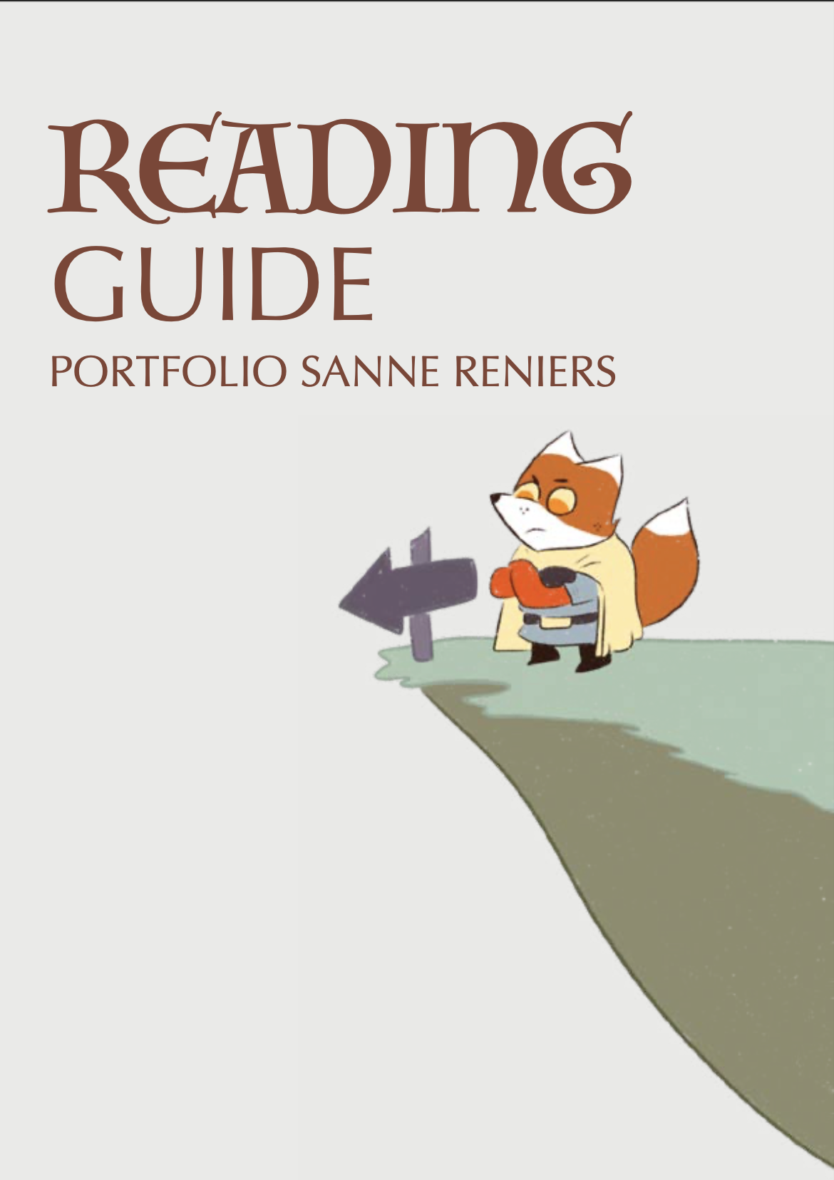
Front page of new reading guide