Sprint X

Follow my process

I created a new website for my student association called "The knights of the kitchen table" to better represent them and showcase who we are and what we do in a more modern way.

Short intro

I was asked to create a website for "the knights of the kitchen table". This is a student association at the TU/e in Eindhoven. At the moment, they have a website that lacks quite a bit in the design aspect. They want something that is more dynamic and modern, and that showcases the current round of active knights.

Main information

Timeline: 16.12.2024 - 19.01.2025

Used software:
Figma
Word
Telegram
Figma
Hugo framework
ChatGPT
Visual studio code

legend
Interactive prototypes -
Transferable production -
Iterative design -
Professional standard -
Personal leadership -

downloadable deliverables
CV
Project plan Sprint X
MoSCoW Template Markdown research
FIGMA inspiration link
Iterations log
FIGMA final prototype
GIT link website
Github pages link
Video showcase
Readme file

What did I learn?

Interactive prototypes

While working on this project I created a few different concepts for the website and tested this with users. This really helped me figure out what worked and didn’t work but also showed me how important it is to ask feedback from multiple groups of people. I learned different things from users, stakeholder and teachers and this helped me get to the end product that I love so much.

Products

Creative iterations

I got feedback from different groups of people which really helped me move forward in different ways. The feedback from Jan gave me the push I needed to try a few more things with the shape, where the feedback from my users made me think more about the way the colours interact, but also gave me the clarification that I needed to figure out which version was the one that I wanted to move forward with.

Products

Transferable production

The learning outcome that I learned the most about must be this one. While working on this project, I learned more about a completely different way of transferable production and what Markdown can also be used for. It doesn't just get used for readme files, but can also be used as a way to store content. I did not know this and had not used it before, but it made for a very dynamic way of creating the website and made things quick and easy once the template was created.

Products

Professional standard

During this project, I did research on a framework and on Markdown. I learned a lot from this, but mostly I learned more about communication with stakeholders and users which really helped me set more steps forward. This showed me how important it is to regularly ask for feedback from not just teachers, but also from other people around you. Everyone has different opinions and during this project I learned more about this.

Products

Personal leadership

During this project I reflect a lot on what feedback I got and what I want to do with it. I also learned a lot more one of my goals for this semester which mostly had to do with the though process behind writing JavaScript code myself. I am really proud of what I achieved and the way I handled things.

Quick access

Career day | Project plan | MoSCoW Template | Research | Inspiration | Interactive prototype | Development | Overall reflection | Semester reflection

Careerday

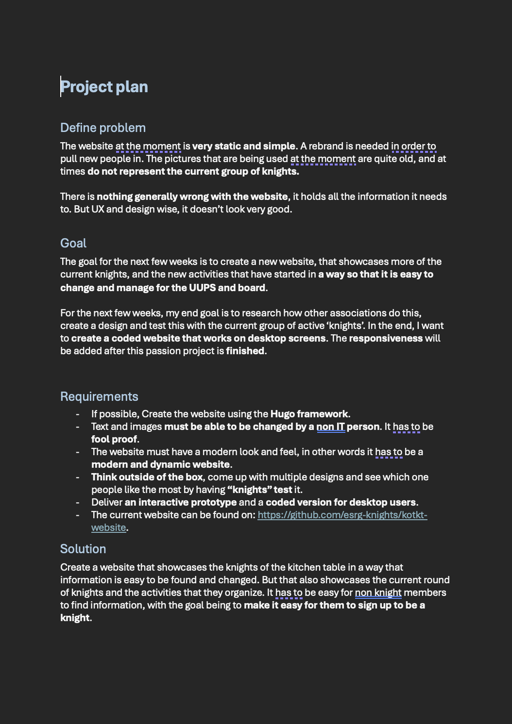
A few weeks before the career day began, I started looking at the specialisations that where available. 1 of these stood out to me almost from the start, education.

There was only 1 problem, an internship was required for this and this proofed to be the most difficult part. I wanted to do my internship at a school that gave media design classes, as this is what I knew the most of. This meant that in the surrounding area of Eindhoven I had 3 options, or so I thought:

  • Koning Willem 1 College, Den Bosch
  • De rooie pannen, Tilburg
  • Sint Lucas, Eindhoven

I e-mailed all 3 of them and after some time, got a reply from all 3. Sadly, the curriculum at the Rooie Pannen has changed so they couldn't offer me anything. The other 2 would have a meeting and let me know as soon as possible if they had a place for me.

By the time the career day rolled around, I hadn't gotten a place yet. So I decided that I'd go and talk to the coordinator of education that I knew would be there, as well as taking a look at Smart mobile and game design so that I had a back-up.

This went really well, and I decided that if education wouldn't work out, that I wanted to go to smart mobile.

By the time that the sign-up deadline was, I still hadn't heard back from any of the schools. I signed up for smart mobile, just to be safe. Now a few days ago, I heard back from Sint Lucas, they have a place for me. My course of action for right now is to try and switch back to education for next semester and hope for the best!

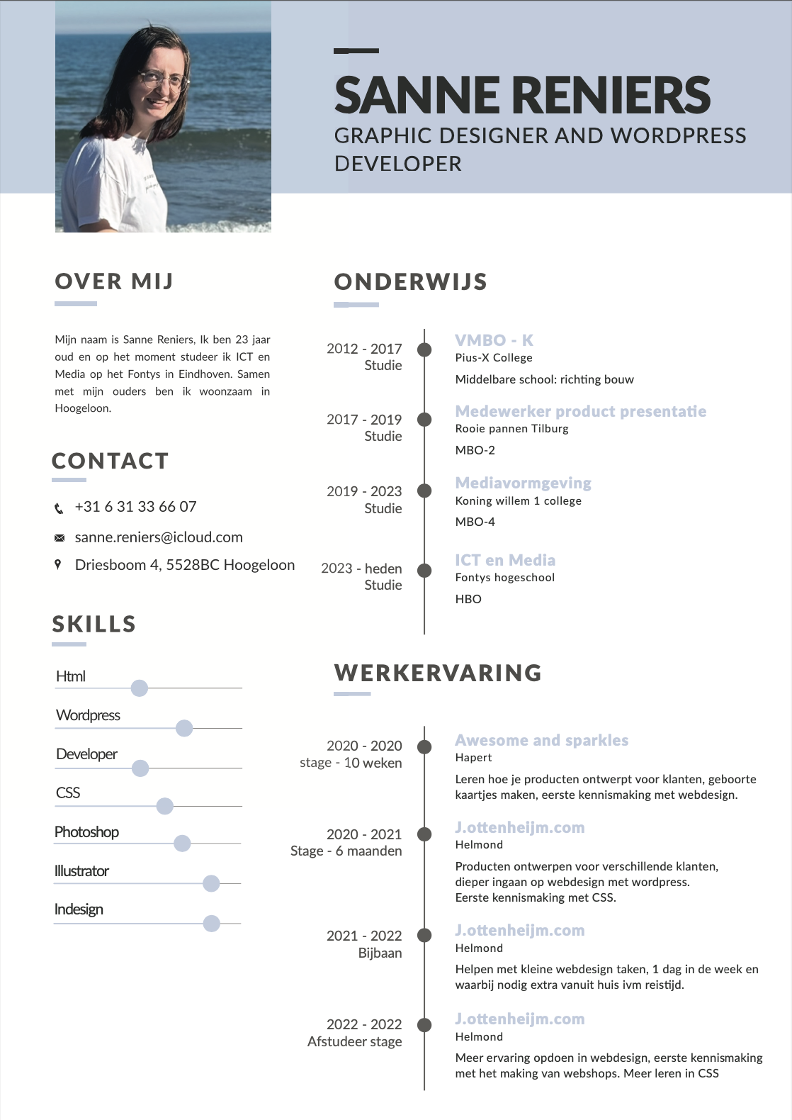
CV that I created to send to schools

Project plan

To start off with, I created a project plan in which I noted down the problem that they're having, the goal and the solution. I also created a list of requirements that they had so that I knew up front what needed to be done. I send this document to my stakeholder, to see if he still had any feedback.

My stakeholder is someone that has studied here before and who knows the curriculum. We decided that it would probably be easiest if we sat down together so that he could tell me a bit more about the assignment, and what he wanted and didn't want. I agreed that this would probably be easier, and afterwards I'd have enough information to finish the project plan.

I did already know a few things up front:

  • A new website is needed in order to create a more dynamic and visually pleasing website that gives interested people the correct information and showcases the knights in a different manner.
  • The website needs to be easy to manage and edit.
  • New pictures are needed and the text needs to be checked.

Project plan for Sprint X. Download here

MoSCoW Template

During the meeting we had, we filled in a MoSCoW template. This helps me determine what is needed in the website, what would be nice to have and what they do not want to be included. At least not at the moment.

We sat together and looked at the current website. We talked about what we wanted to do differently content wise, we did not look at what we wanted to do design wise just yet, that will come at a later time.

The main takeaways from this meeting are:

  • The website must have a modern and dynamic look and feel
  • It has to be maintainable by a non IT person ( fool proof )
  • I have to create more then 1 design for the homepage, think outside of the box
  • We will not have a fully implemented website, but only a Figma prototype is also not acceptable.
  • Take a look at the Hugo framework and see if this is useable.

I think that I can learn a lot from this project, and I am very curious where we will end up. This project gives me a lot of opportunities to try new things out, but also to work test things with other people more easily. I think that by doing this as my passion project, I can learn more about frameworks and how to create something in a way that it can be updated easily.

The MoSCoW Template that I created with my stakeholder

Hugo and markdown research

While creating the MoSCoW with the stakeholder, it was mentioned that they needed a website that could be easily edited text wise by someone that does not understand code. At the moment, they use a combination of Hugo and Markdown. I decided that I did not want to make this any more difficult for them then needed and to also use the same framework and way of editing so that everyone that knows how it works now, will still know and understand how they can edit or add new pieces of content.

For this, I looked at both of these separately and tried to figure out how they worked. I could see that Hugo is mostly used with themes, which is not what I originally wanted. This meant that in order for me to use this framework, I'd need to create my own theme. I looked up some things about how they're created, and did a tutorial as to how to install Hugo and how to set up my own folder structure. In the end, I decided that instead of starting from scratch, I'd use the files of the old website so that I the folder structure, but to delete those files. It was a lot of trial and error, but I'm very happy with what I eventually put out.

Next, I did some research in how markdown works in terms of web design. This was before I started trying things out with Hugo and knowing exactly how Hugo worked. So in the end, this research was kind of useless but it did help me kind of figure out and explore how markdown is used in web design when there is no framework being used.

The markdown research

Inspiration

The next step I took was to go on Dribbble and to find some inspirational web designs that I could use parts of to create my own. This made sure that I had somewhat of an idea of what I could try. But also gave me more ideas in general of what might look good. I made sure not to actually copy them, but to use them to my advantage to create something that I thought looked cool.

These images helped me figure out what I wanted to create, what way I could move into and what might look cool. I knew a little bit which way I wanted to go into, but I didn't know exactly what I wanted. By looking at what other people have created I got somewhat a feel of what I wanted and it gave me some ideas of what I could try and what might work. This helped me a lot in the process of creating the following 3 designs.

Inspiration for the website

Interactive prototype

Once I had somewhat of an idea of what I wanted to create, I started making 3 different designs. In order to pick the correct one that I wanted to move forward with, I send these to some of my target audience and had them tell me what they thought of them and what they liked and/or disliked. This included my stakeholder, but also included some other people. I also asked some people what they thought when I was working on the design themselves in the knights room, which is located in the basement of “luna”.

I got a few different things back from users:

  • The dark background looks good, the gradient really fits in.
  • The text on the left looks the best as this immediately pulls your attention to this side.
  • Maybe try a different yellow? The mac and cheesy yellow looks a bit off. Maybe try a more fantasyish gold?
  • The more modern blob shape feels a bit out of place. Maybe try a d20 shape

Except for these points, everyone that I talked about picked the 3th option I had. Except for users and stakeholders, I also asked Jan for feedback on my designs to see what a teacher would say. This gave me a different perspective and helped me figure out what would work best.

A few things that Jan mentioned where:

  • It looks a lot like something for a game, make it feel more like an association by highlighting the community.
  • The 3th design highlights this the most, but the d20 falls away. For most people it is just a hexagon, try playing around with this a little bit more.

Design for knights website 1

Design for knights website 2

Design for knights website 3

From here on, I played around with a few different things:

  • I tried ways to highlight the d20 shape a bit more by adding in lines to create the different sides. This didn't work at all as it just made it look really weird and distracted you from the video that was then playing inside the shape.
  • I tried to put the video inside a shield shape. The shield is a big part of the logo, and this ended up working really well with the rest of the layout. I put the d20 and a boardgame meeple in the background on a low opacity so that it still showcases what we do without it being too much.

I am really happy with how this turned out and with he way the webpage looks and is functioning right now. With some help from Artem I was able to create a slider in the prototype and I really like how this looks. This is something that I also want to develop in the final coded prototype.

Final design website

Development

Once I had the design and I was just waiting on people to tell me what they thought I started working on coding the website itself. This took a little bit more trial and error then normal as I also had to figure out how to do this with markdown and Hugo.

I eventually found out that the way markdown and Hugo work is that with html you create a template, and then with markdown you fill in what content needs to go in which placeholder. This makes it really easy for someone to just add new content, but also to add a new container just by copy and pasting the bit in markdown.

I made sure to place comments in my markdown file that explained how to edit it, and what to do when they wanted a break in between their paragraphs for example. I think that by doing it this way, it is very clear for the user how they can edit the content and how they can add in new content in general.

I spend a lot of time creating templates and making sure that everything would work on desktop screens. For the way that it will look on phones and tablets I want to create a new prototype, but this will happen after the semester has ended.

Markdown for hero image

shortcode for hero image

The last major thing that I developed for this website was the slider. I started off by thinking how this could work just by clicking the buttons. I got quite far, but eventually got stuck when the buttons got removed when clicking on one of the buttons. This had something to do with the classes not being assigned correctly. After a long search on google I went to ChatGPT for help. This helped me figure out a different way to do this, but didn't solve my problem at first. I eventually figured out a few things:

  • The way I had it at first would've worked if I had the controls stay the same. What made it not work was that the slide that was being changed had a different set of controls too. This made everything act a little weird.
  • I removed the controls from the slides itself, and added it in as a separate short code. I then gave this a minus margin-top so that it sat at the place where I needed it to be. This solved this problem, and made it so that when you click on the middle one, this circle becomes filled in and the second slide gets shown. This is exactly what I wanted and I'm very proud of this!

My next step for the slider was to have it change slides after a certain amount of time has passed so that it cycles through the different videos that we'll have. But also so that it showcases the different parts of the knights.

I was a bit lost with this, and decided to ask ChatGPT for help with his too. He created code for me, and this worked great. I didn't understand part of the code, but after looking into this more thoroughly I now know what it does, and how everything works the way it does. The last bit that I wanted to do was to add in a push animation.

Code for the slider

I added a div around the content that I wanted to be changed, and gave this the class. This made sure that the background and the lower opacity images stay put where they are, but that the content itself changes with an animation. For this, I add a .push class to the element at the same time that it gets the .active-class class. After this, I had 1 minor problem, the part with the shield kept moving further left with every push animation that it went through.

This was because of them both having the position absolute position. I solved this by doing a few things:

  • I removed the position absolute from 1 of the elements
  • I added in a position relative on the div element that surrounds the 2 shields
  • I added in a display flex on the div that is now around the actual content.

After doing these 3 things it solved my problem. And I am very happy with the way everything turned out. While working on the development of this project, I noticed 1 thing that I still had to address, a few of the committees that the knights has who organise activities every month are not being mentioned. To solve this, I send an email to the board and then afterwards, send e-mails out to the committees to ask them to write a small paragraph of text that I could put on the website so that everything we do is mentioned on there. The only thing that still has to happen at a later moment is to put in new, better pictures.

Full final website in video format

Overall reflection

Looking back now on this project, I am very happy with the way it looks and what I learned from this in terms of transferable production. This was a very different way of working and a different kind of transferable production then what we normally do. Normally, it has to be transferable to someone that understands code so that they can continue working on it. This was not the case for me. Someone that did not understand code had to know how and be able to change the content of the website. This brought on it's own challenges but I am very proud with he way I did this and it was very interesting to see how easy it ended up being to just create the short codes and to then have the content in a different document. I loved working on this project, and I am very happy with the way it turned out.

Semester reflection

With the end of the semester in sight it is also time to look back on this semester and to write about what I learned and what I want to take with me to the next semester.

In general, I am very proud of the way I worked my way through this semester. I started off strong, but I also realise that I slacked off a bit during the first and second review. This should not have happened and I learned a lot from this moving forward. I learned that it really helps me to set goals for myself each week so that I can clearly see that I did something, but also so that I don't just sit around doing nothing without realising this. I want to continue doing this in the next semesters so that I can keep moving forward with everything I do.

I learned more about JavaScript this semester, and I'm really proud of what I can do on my own right now without needing to consult google and ChatGPT for every minor thing. I am able to create simple JavaScript functions on my own, and I'm very proud of how far I can get.

I sadly was not able to work on blender a lot as my laptop could not handle this. I hope to look a bit more into this in the coming semesters as I do really like what you can do with this.

Next semester, I will be doing an extra internship for education at “Sint Lucas” This is a creative school in Eindhoven where I'll be teacher Graphic design and ICT. I am really looking forward to this and I know that I'll be learning a lot more while I'm there. This might nog always be in terms of media design and ICT, but I think that at the end, I'll have more skills communication wise then I do right now.