Partout

Follow my process

We got asked by Partout to create a proof of concept to solve the problem that CBR is having. This ranged from research, to design to testing.

Short intro

After creating a studio, we had to choose a project that we, as a group would like to work on. We discussed this together and decided on taking on the project that Partout had briefed to us. A short briefing of this project is:

CBR would like to change their imago to be more known as a companion on the road. They want to help students pass both of their exams on the first try, and in doing this shorten the waiting lines that are troubling them a lot at the moment.

We have to create a concept for this, and create digital and/or physical prototypes in order to test and validate this.

Main information

Timeline: 30.09.2024 - 10.12.2024

Used software:
Monday
Procreate
Adobe illustrator
Figma
Word
Teams

legend
Interactive prototypes -
Transferable production -
Iterative design -
Professional standard -
Personal leadership -

downloadable deliverables
Project plan
Research question
Interview notes
Dashboard inspiration
Dashboard Iterations log
Dashboard design FIGMA
Dashboard Interactive prototype
Final presentation PDF
Presentation video Final Presentation FIGMA
Competitive analyses
MoSCoW template
Eisenhower matrix

What did I learn?

Interactive prototypes

During this project, I worked on creating a FIGMA prototype of the dashboard along with creating a concept and testing this concept with users. Some main takeaways of this process are:

  • Test the prototype with someone that will actually end up using it, in this instance a driving instructor and not just the teachers that you already know.
  • Keep in mind who you are creating something for. Someone that uses the app every single day knows how to use it, and everything that clutters it up is not needed.

Products

Creative iterations

During this project, I terated a lot based on feedback that we got from teachers, users and stakeholders. Some takeaways from this feedback are:

  • Votin on colour palettes without having examples of what they would look like in a logo for example isn't the best practice. You don't know what it'll look like until you try it out.
  • Creating effective creative design solutions requires extensive experimentation and mulitple iterations.

Products

Professional standard

During this project, I learned a lot about how to do research in a professional manner. We had 2 students that re-do the semester, and I noticed that they know a lot more about what research is needed and how to best divide these kind of tasks. This was really helpfull for me, and in the past semesters I noticed that the research front was a bit lacking on my part.

I also helped with the mails that we send to the stakeholder and gave feedback them whenever we send them. I do think that we could've kept a better communication with them, which would've helped with miscommunications.

Products

Personal leadership

During this project, I reflected a lot on what I want to learn, what my goals are and what I learned in this process. I reflect on each part of the project, what feedback I got and what I thought of and did with it.

Products

Quick access

Project plan | Research | Expert interview | Brainstorm | Changing the scope | Competitor analysis | Wireframes | Interactive prototype | Presentation | Retrospective | Overall reflection

The project plan

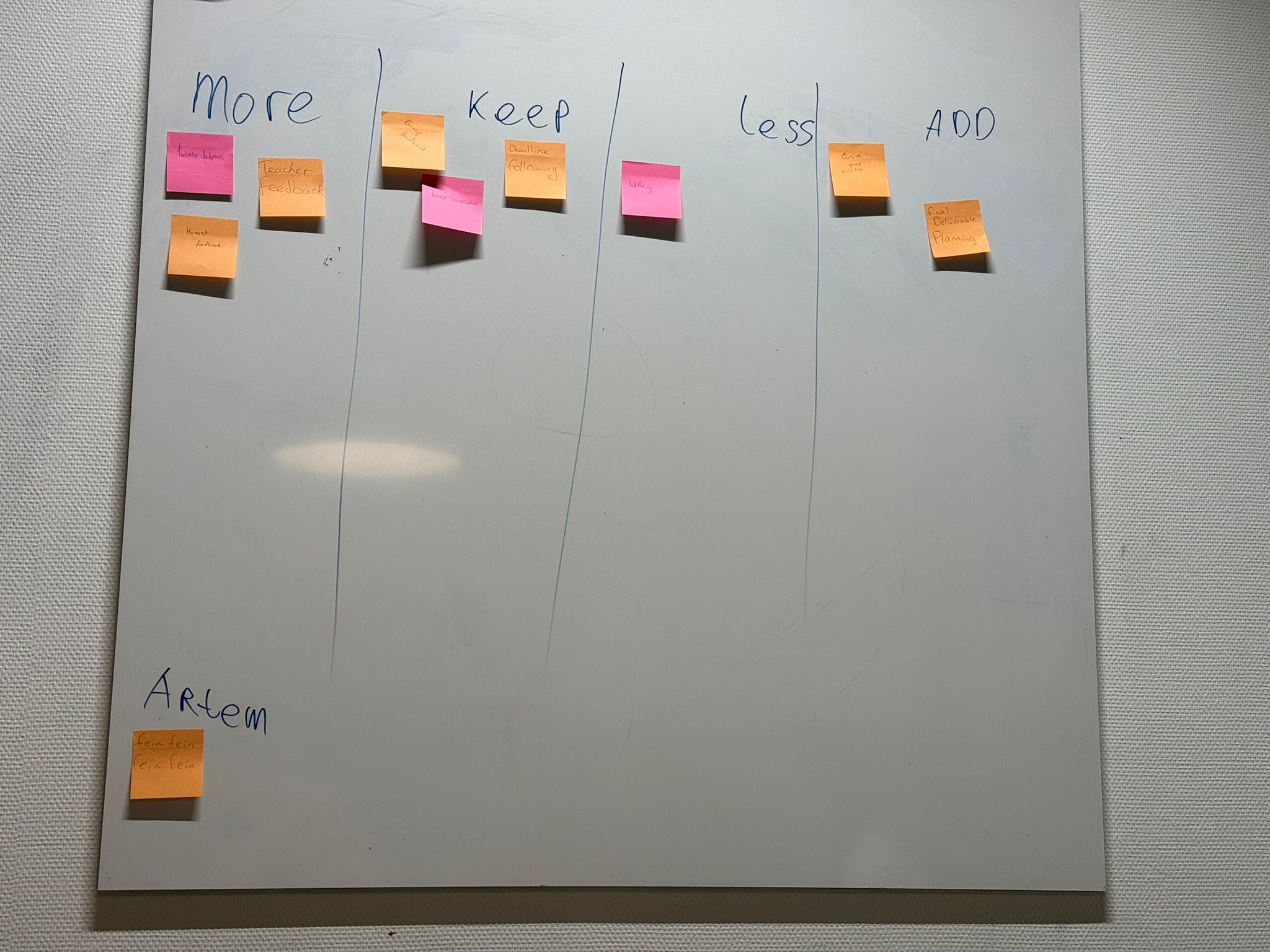
For the project plan, I copied over the layout that I used for my sprint X planning last semester. This helped me a lot with laying some things down, and made sure that everything that needed to be in it had a place in the document. I think that in the long run, this will really help us with keeping track of things and making sure that everything gets done.

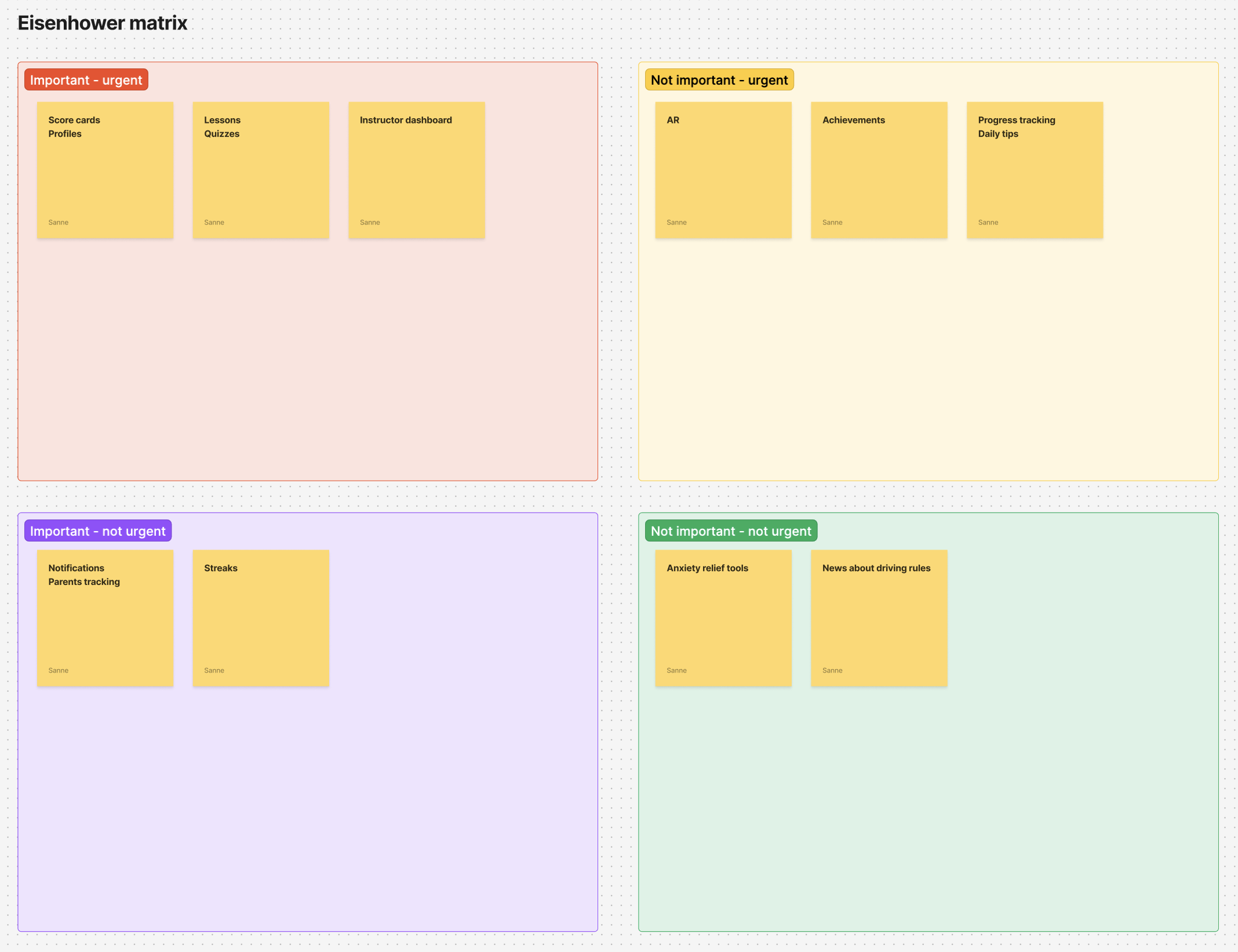
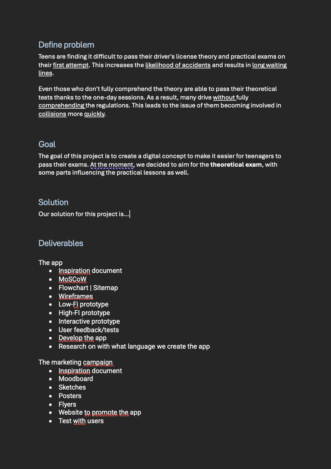
In here we have defined our main problem, our solution to this problem and the deliverables that come with this. We have divided the deliverables into 2 different columns.

  • The app
  • The marketing campaign

We are with too many people ( 6 ) to work on just the app with all of us, so we decided to divide the group into 2 smaller groups. 1 group for the app and 1 group for the marketing campaign. In order to make sure that both groups have some kind of coding in their project, we thought that it might be good to create a website to promote our app. This will help in the long run with getting enough things in our portfolio's.

My job during this project will mostly be to help out wherever needed. I am in both of our sub-projects and will help with either advice or creating things when I am needed in one of the groups. This is follows my last reflection, where I basically said that I want to make others have a chance to learn and grow in designing things too. I'm not going to sit back and do nothing, but I want to take more of a helping and feedback type of role design wise. ()

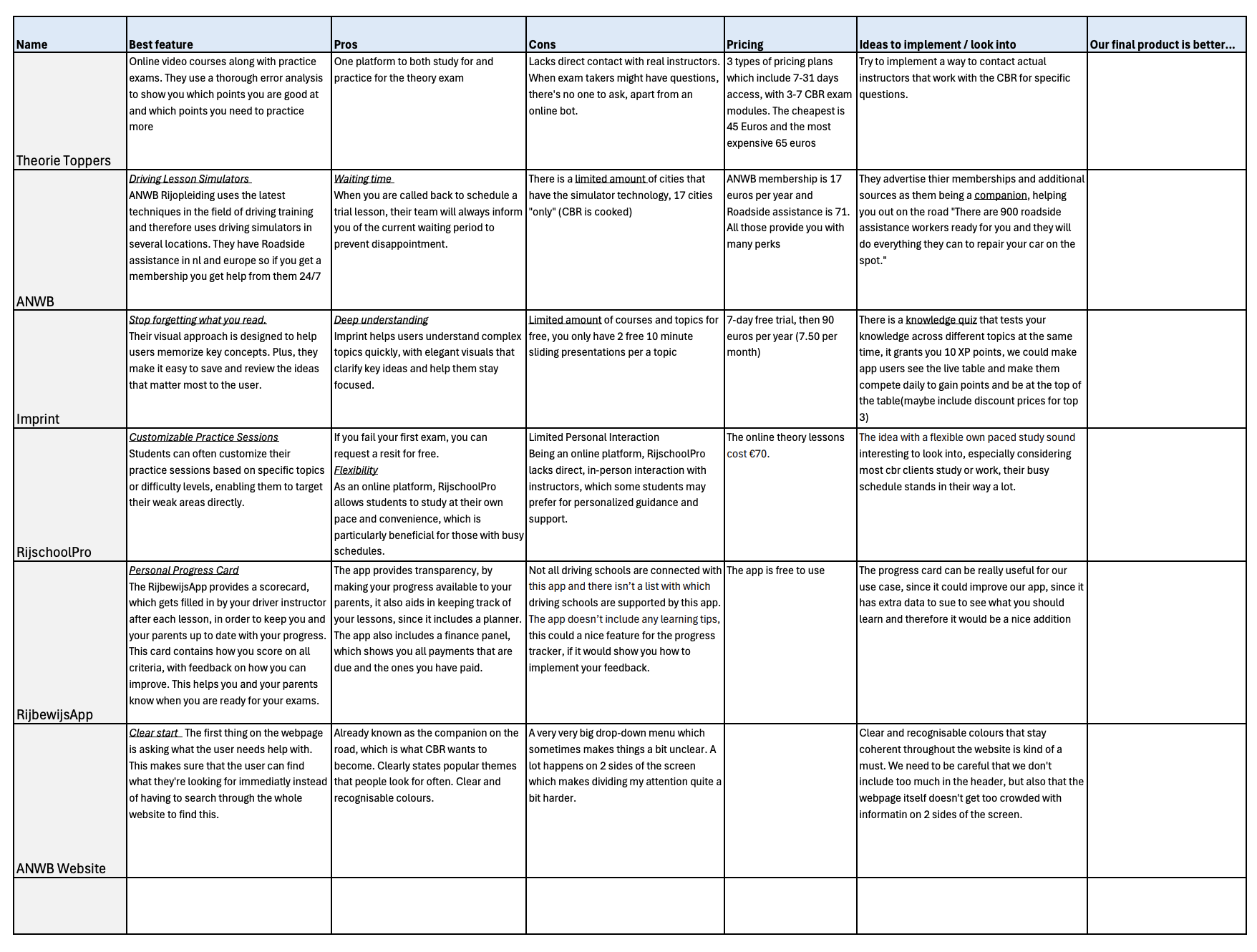
During the time we spent on the project, our concept changed. This also meant that the project plan had to be changed as to be in 1 line with our current concept. This new version can be viewed here

Project plan - Click here to download the pdf

OUr research

We came up with 6 different research questions and then divided those questions underneath the members of our team. The question that I got was:

“ How can we help teenagers get over their anxiety “

The reason for this question is mainly that we found out that a big factor in people failing their theoretical and practical exam is due to stress and exam anxiety. One of the things that CBR wants to achieve is helping students pass their exams on the first try. Helping them overcome their anxiety is a big step into this. ()

Some of the main take-aways from this research are:

  • Anxiety mainly outs itself in thoughts or beliefs. They make you feel restless and/or tense and interfere with your normal day by day life.
  • There are some things that can make symptoms worse such as: Caffeine and certain types of medicine.
  • Anxiety can be regulated sometimes by a few things: Mindfulness, thinking positive instead of negative and growing self esteem.

More about this can be read in the full document which can be viewed here.

Expert interview

In order to get a bit more insight from someone that works in our field daily, we did an expert interview with a driving instructor. He owns his own driving school, and can give us a bit more insights as to what he notices with his students. ()

Our main insights from this interview where:

  • 30% passes their theory exam on the first try, 70% fails.
  • Preparation mostly consists of driving a lot. Roughly 40-50 hours depending on the student.
  • Anxiety is a huge factor in students not passing their exam.
  • Students need to grow confident in their ability to drive.
  • Put in the time to learn something, the day workshops all goes into their short term memory and won't be remembered on the long term.
  • Do not add things in that will add more stress and money onto the students.

You can view the notes of this interview here

Brainstorm

In order to have a better idea of what we could create that could help our target group, we created a lotus blossom, from which we created 2 different concept ideas.

  • Study app, Campaign, Gamification, Clear expectation, visual branding. progress tracking, Reviews.
  • VR experience, grow self esteem, Community, Events, rewards, Forums.

Doing the lotus blossom really helped us create concepts that we didn't think of before. It meant that we had to think a bit more outside of the box, and in ways that we normally wouldn't have. For me personally it was a really good exercise to just throw out ideas, and to think of ways to combine some of these afterwards. I wasn't thinking about final concepts but more of things that had to do with what was written in the middle of the block. ( )

Lotus blossom diagram

Changing the scope

We sat together as a group, and decided what we would keep and what we didn't want to keep in our app. We originally had a lot of ideas which if we had all the time in the world, would all make it into the app. But sadly, we are working on a time-based schedule and due to this, not everything would be possible. We sat together and at first, created 2 MoSCoW templates to showcase what we thought where must haves, and what we wouldn't be doing anymore. We did this in order to help us see what we needed to work on first, and what could wait until a later moment.

We showed these to Dirk, and got back some feedback. This mainly led to:

  • While using a MoSCoW for this isn't neccecarily wrong, it is not what is commonly used in practices like this. Most people use something that is called Eisenhower Matrix. This works with terms like important, not important, urgent and not urgent. By doing this, it is much easier to see what is and what isn't urgent. Something can be not important, but still more urgent than something that is important. ()
  • We also decided to make the project a little bit smaller. Instead of doing the app and a marketing campaign, we decided to do just the app. We also decided to leave out the coding part, and to just give them a functional interactive prototype as a proof of concept.

First Moscow template - click to view

Eisenhower Matrix - click to view

Comptitor analysis

I looked at the website of the ANWB to figure out what things where that we could incorporate in our concept, and if there was anything that we particularly didn't want to include. A few of the takeaways from this research are:

  • The first thing on the webpage is asking what the user needs help with. This makes sure that the user can find what they're looking for immediately instead of having to search through the whole website to find this.
  • Clear and recognizable colors are a must, people need to be able to see that they're on the same webpage all the way through to the end.
  • Don't include too much on information on certain pages. Give it to the students in smaller parts.

I think that by doing this, I had a clearer view of what to look out for, as well as knowing more about what was already out there, and how they did their UI/UX design. This helped with figuring out how we wanted to do it. ()

The full analysis can be viewed here

1st wireframe of Dashboard

Dashboard wireframes

While Artem and Furkan where working on the wireframes for the student side of the app, I worked on creating a wireframe that is going to be used by the instructor. This is going to look completely different then the app that is going to be used by the students, while still clearly showcasing that they belong together in terms of the color's being used.

For this, I took inspiration from some the inspiration that we had already agreed upon before, this made it easier to make decisions myself, without having to consult in my team members every second. I thought about what an instructor would want when thinking about this app. I know how the student would use it, and it was then up to me to decide what would be helpful for the instructor to change the lessons based on what the student needs. This information is taken from the student side of the app, and given to the instructor so they can alter these lessons to what the student finds hard or difficult or to what a lot of the students find difficult. ()

This in turn helps the student learn in a way that feels natural to them.

1st wireframe of Dashboard

I got feedback on the first version of the dashboard from Dirk. Some takeaways from this feedback where:

  • The instructor uses this dashboard every single day and knows how it works. Try not to clutter it up with things that they don't need. In the long term, this will annoy the user.
  • Try to test the dashboard with an instructor, he might have some interesting insights

After this feedback, I filled in the contact form on the webpage of the instructor that we had the expert interview with. Sadly, I didn't get a response on this and therefore, was not able to test it with an instructor in the end. I do think that this feedback is very good, and definitely something that I will take with me to further semesters. I do think that testing it with the correct target group is very important, and I would've loved to be able to do this for this project.

2nd version of the dashboard

Interactive prototypes

Eventually, we found out that the color scheme we had going worked for the logo and the dashboard, but not for the app. This made us rethink our choices and we decided that we would look into changing the colors so that it would match all 3 parts of our concept. This aligns with what I found out during my competitor analysis too.

We as a group tried out a bunch of different colors, but eventually settled on a white/grey/green theme which we felt like showed off the standards that we had from our studio, but also gave off the feeling that it was a place to learn, while not giving off the vibes that it was a car rental app.

The dashboard can be tested here ( FIGMA prototype ) ()

Final version of dashboard before the presentation

The presentation

I created a template for the presentation, which combined some of the brandmarks from Sakura Creative with the brand that we created for Drvn. I did this by using FIGMA their presentation tool. I quite liked how this worked, and how I could add elements myself in a dynamic way, in kind of the same interface as what FIGMA uses for their prototyping canvasses.

We later filled this in together, so that everyone that was presenting had the information in the presentation that they needed or wanted to have in it.

I did not present myself, but instead recorded the video. For this, we used a stative that I borrowed from the media crew. This stative is created for a phone, and lets you control it in the same manner that you would a camera that is mounted on a gymball. This makes sure that the video isn't shaking.

During the presentation we got some feedback from our stakeholder and a teacher. This feedback was:

  • Use the branding of CBR, this is mainly what I am really missing at the moment.
  • How does it contribute to reducing anxiety? Especially considering as there is an option to notify parents of their children their process.

For the first point I've made an iteration so that it shows CBR their brand a bit more. We've thought a lot about the second point. This can work both ways. It promotes transparency, which can also reduce anxiety in students and their parents as parents can help them learn. This is why we added it in as something that a student can turn on themselves if this is wanted.

Due to this and the example that Quinn gave; I do not completely agree with their second feedback point. The first point on the other hand is something that we could've thought of ourselves, we took the “You can give it a twist” a little bit too directly and this shows in our design. But, I do really like what we came up with, and I'm proud of the way we handled things as a group.

Final version of dashboard after the presentation

Retrospective

Every few weekks, we made sure to do a retrospective in order to keep a clear communication, and to make sure that everyone could share what they felt needed to be done more or less of. Some of these things include:

  • More feedpulse checkpoints
  • More feedback from teachers
  • More open communication
  • Keep group feedback
  • Keep giving honest feedback
  • Add final deliverable planning

These retrospectives really helped me know what was going on, and what other teammembers where thinking of how we where doing as a group. It was good to get everyone their stance on certain matters, and how we could improve so that everyone feels listened to.

Retrospective Partout group project

Overall reflection

While working on this project I learned a lot about working in a group, but also about the difference ways of research, and how important it is to research things well. I also learned a lot about communicating and listening to your client. I think that if we stayed in contact more with our client and asked for feedback about our design before the presentation that we would’ve had a better understanding of their wants and needs.

I am really happy with how this project turned out, and I'm proud with what we ended up delivering. I really enjoyed working on this with my team mates and I think that that goes for almost all of us. ()